Help Center Redesign
A web re-design of Moxi Works Help Center site. I noticed that the support teams help site looked dated and approached them to see if they’d be interested in meeting with me to talk about a re-design that I could do in my spare time.
Duration - 3 months
Role - Sole UX Designer
Tools - Sketch, InVision, Jira
Responsibilities : Competitive Analysis, User Research, Wireframing, Prototyping, light coding, testing.
The Product
A web redesign of a help center site that was used by both customer support staff and end users.

The Problem
Both end-users and internal users were expressing frustration with the Help Center, because they were unable to easily navigate the site or find important information they were looking for. This resulted in end users not trusting or using the website and increased calls to our support staff.
The Goal
There were several goals I wanted to accomplish with this redesign of the Help Center. Make it easier for any site visitor to find the help that they are searching for by (1) organizing the site information and architecture to standardize how articles are handled, (2) make the site more responsive and easier to access on mobile, and (3) give the site a visual refresh.
Discovering
-
Client Complaints
-
Client Requirements
-
User Frustrations
-
Design Review
Discovery
My first steps were to meet the stake holders of the site - the support staff. They not only ran the site, but consistently contributed articles to it. It was important to interview them because of their daily connection with the end-users , as well as finding out general requirements for this project.
Client Complaints
1
Site isn’t well organized and hard to find what they’re looking for
2
Isn’t great on mobile because of how different levels of articles/categories are shown
3
Easy to get lost on because of the overwhelming amount of info on the screen at times
4
Looks dated and support staff was slightly embarrassed when recommending it to users
Client Requirements
1
Site must still use their ticketing systems site platform
2
Must have the Moxi logo present
3
Have an email contact form (linked to their ticketing system)
4
Search should be visible on every page
User Frustrations
Once I got a good sense of what the clients wanted, I started looking at end-user feedback. We had a very robust feedback system via Jira and so it was fairly easy to find feedback specifically about the help site.

1
Content was hard to navigate on mobile
2
Articles were hard to find because they weren’t categorized under the expected product
3
Easy to get overwhelmed when clicking around (due to accordion style layout)
4
Confused by overlapping or duplicate information
Design Review
Reading feedback from users was tremendously helpful to get a sense of what they were looking for in the help site and also a little background information on themselves. After this, I dove into the Help Center myself to conduct a design review.


-
Hierarchy not well defined when multiple categories are expanded, aggravated on mobile
-
Lack of consistency with article organization
-
Redundant categories
-
Not very responsive on mobile devices
-
Accordion style categories made the page very info heavy which makes it hard to visually focus on one element
-
The page becomes too long to scroll through and very visually cluttered
-
Doesn’t have a consistent page scan pattern
Defining
-
User Research
-
Personas
-
Information Architecture
-
Card Sorting
-
Goals
Design Review
Finding out more about the sites users was very important to further defining the goals and direction of the redesign. I mainly focused on finding out more about the end users since I got a very good idea of the local staffs needs when initially interviewing them and further talking to them about the project in general.
I reached out to several end-users who had expressed dissatisfaction with the help center and proceeded to interview them. What I really wanted was to get a sense of the different ways in which the site was being used.
Some information I inquired about:
-
Their role in the office
-
How they’d rate themselves with technology
-
Their typical day to day routine (when using the site)
-
Age
-
Tools of the trade for their position
-
Specifics on feedback they originally submitted
In total I was able to interview 20 different users and was definitely able to make out certain patterns which lead to a few personas and insights.

Insights :
-
General tech fluency for most agents is low. They know how to navigate basic websites, but quickly get overwhelmed.
-
Most agents are unhappy with the ambiguity of the current site layout. Specifically the accordion drop downs for categories.
-
Office admins are the local office experts on Moxi products and frequent the help center to brush up on their knowledge and to guide less tech-savvy agents.
-
Help Center is predominantly accessed by larger screens - laptops and desktops.
-
Site looks old especially compared to other help sites they frequent - brokerage site, domain help centers, realty apps.
Information Architecture
A common complaint from users and client was that it was hard to find content and that categories didn’t make sense. The first step was to create a clear information hierarchy (which would later be bolstered by visual hierarchy) that would not only make sense for end-users, but also be easy to maintain for the client.

A simple but effective way of organizing content. Looking through many other help centers that agents frequent this is in line with what users are used to and would lessen the time to get accustomed to.

Design Review
Once the general information hierarchy was solidified, I wanted to get more specific into what content would be the top level categories, sub-categories, and corresponding articles.
Before the card exercises, I requested access to the CMS system (where articles were made), so that I could take a look at all the content and try to glean some organizational insights. Once I had specifics on current articles, categories (products), and sub-categories, I started card exercises with members of the support team as a group.

Reasons for testing as a group :
-
I could hear their brainstorming and thought process as a team
-
Group dynamics would help to form a cohesive system, rather than individual preferences
-
Different levels of product knowledge and user knowledge talking through labels and categories together
Goals
From client and user interviews, organizing the IA, and earlier design review, I felt I had a strong idea of what goals this redesign should aim for to enhance the experience of different users.
-
A new visual hierarchy to bolster how content is organized
-
Make it easier to navigate between articles
-
Improve mobile experience
How to Gauge Success?
One of the last steps before I set pen to paper was to determine what KPIs I should set/monitor in order to track the success of the redesign after deployment.
Since the site would be connected to the support departments CRM and ticketing system, I knew I could track how many hits articles got on the website, and from what device. Another thing to consider would be feedback once the roll out for the new help center was announced.
Since I had a reliable feedback system and built-in analytics, I’d be looking for an increase in not only traffic, but also positive feedback.
Design
-
Wireframes
-
Testing
Paper Wireframes
Keeping in mind the previous flow and IA created, I started ideating solutions by putting multiple ideas to paper. This allowed me to quickly explore different ideas that met previous requirements and goals.
I knew I had to have branding, search, and a contact link as elements on the page so I started there. I also played with different ways of showing categories, sub categories, and even a few select articles on the landing page. What I quickly found, was that displaying too much information at once, regardless of how I tried to organize it, was visually overwhelming and difficult to navigate.

Home page 1 and different flows

Home page styles translated to mobile version

Home page styles translated to mobile version
Home page 1 and different flows
Intermediate Wireframes
Using the paper wire frames that met all user requirements I translated them using Sketch and focused on expanding every part of the flow.
Landing Page
This landing page works for various reason : all top level categories could be shown above the fold in a clean and uncluttered layout, allowing for a hero image which could visually lift the site, and meet the branding, search, and contact link requirements.


Category Selection
Since a category could hold multiple sub-categories, which in turn could have many articles, it was important to introduce a sense of visual hierarchy. I achieved this with space, shape, and text heading types working together to reinforce “F” style page scanning.
By default some articles are also shown to sub-categories in order to give users unaware of the product an idea of what help they could expect.
I also introduced breadcrumbs. A common issue with the previous site was lack of any navigation other than going back to the landing page.
Sub-Category View
Once at this level, users would see articles in a very legible list. This list was maintained and sorted on the clients side via their CRM system.


Article View
Several considerations had to be taken for this page. Since this site was primarily content focused I wanted to make sure that that content was center stage. The articles/media are taken directly from the Support teams CRM, which uses a WYSIWGY style editor.
I also wanted to include a way to quickly view past articles that the user may have visited. This would be especially useful for admins or other users who want to quickly link/show others that article.
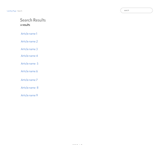
Search View
This was for the most part pretty straight-forward on the design end. Article names are shown clearly with pagination to navigate between results.
Corresponding mobile wireframes


Release
-
Testimonials
-
Post-Release
-
Thoughts
Takeaways
Impact
“The site looks nice! It’s easy to use now and I can use it on my phone.”
“This looks new but I can find stuff better now. Thanks.”
“I saw the new site on a webinar. Just wanted to say thanks. I use the site a lot and got used to the old version but I never recommended that site to others in my office. Now I think I will!”
What I learned:
This project was a learning experience on so many fronts. It reaffirmed how important it is to have an organized site structure, the value of auditing and knowing the content on your site, hierarchy, and also gave me a better understanding on how to work with technical restraints rather than against.
20% average increased site traffic per week
7% increase in mobile traffic
Post-Release
I continued to work on the site off and on for the next following months, improving some quality of life changes from more feedback received.
Some post launch changes were:
-
Adding the ability to select a different article in the same sub-category while viewing an article
-
Adding a voting function to articles to gauge whether the user thought the article was helpful or not
-
Using CMS system meta data in order to suggest other articles
-
Adding dividers between article lists
-
Adding ability to request for more help at the end of an article